Since we launched Pottermore, our one million Beta users have given us lots of amazing feedback, and we’ve been collecting their thoughts and comments so that we can make Pottermore the best experience it can be before it opens to everyone.
After looking closely at all the information that we've gathered, we have decided to further extend the Beta period so we can improve Pottermore before giving more people access. This means the site will not be opening to new users in the immediate future, but please know that we will open registration as soon as we can.
As part of our work to make Pottermore even better, we'll be taking the site down for a few days on Wednesday 2 November. We're going to use this time to make a few technical changes behind-the-scenes.
We've set up a separate page on the Insider so we can give you the latest Beta information and answer some of the more common Beta questions. We'll be updating it as the Beta continues and posting on our Twitter account, too.
So Pottermore will not be opening to new users just yet. For all of you who are waiting to enter Pottermore, we want to thank you for being so patient - we’re working very hard to make some exciting improvements, and we're really looking forward to welcoming you to the site when it’s ready.
Behind the scenes: the Pottermore house crests
(part two)
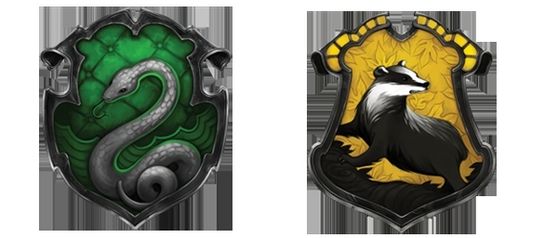
In the first of our ‘Behind the scenes’ posts we shared the Atomhawk Design team’s work for the Gryffindor and Ravenclaw house crests. Today, we’re taking a look at how the Hufflepuff and Slytherin crests were created.
Creating consistency and personality
You’ll remember from part one that the art team was focused on using J.K. Rowling’s descriptions to create crests that accurately reflected the strengths and personality traits of each house. They wanted each detail to lend to the overall feeling of house pride.
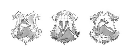
Hufflepuff sketch series
The Hufflepuff crest proved to be the most difficult creation for the team. There is a limited amount of detail about Hufflepuff house in Harry Potter and The Philosopher’s Stone and they were aware that they needed to work a little harder to make the crest feel authentic and representative of the Hufflepuff nature. There was also the question of how to show the badger as a tenacious animal, to show Hufflepuffs as unafraid of hard work.
In the first crest you can see the badger almost resting on a bed of leaves, but the team felt this version looked too approachable and inactive. The drawing in which the badger is facing forwards didn’t look enough like a traditional crest and also made the animal appear too gentle. It was finally decided that the badger that was the most faithful to the Hufflepuff house qualities was the one on all fours, posed as if defending its territory and warning off others.
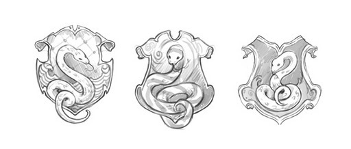
Slytherin sketch series
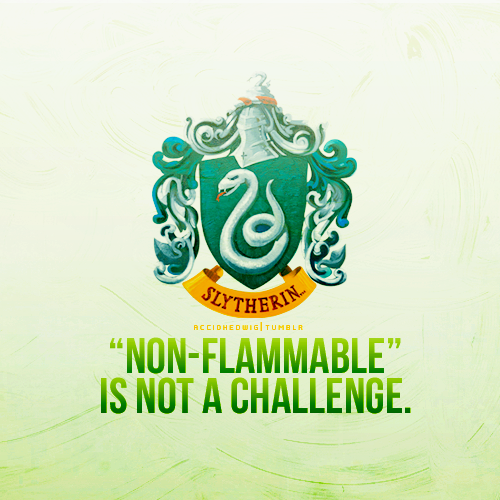
The art team tried out a number of different snakes for the Slytherin crest, as they wanted to ensure the one they used didn’t resemble a particular type of serpent (such as a boa or a cobra). The coil of the tail was another focal point as the artists wanted the snake to look natural, but not inactive.
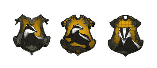
Hufflepuff colour process
In the artwork above, the yellow background was slightly muted to add some focus, but the team decided to brighten the final versions to make the badger as striking as possible. The silhouette of the badger was thought to be stronger when the entire body could be seen completely surrounded by yellow.
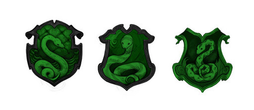
Slytherin colour process
The team tried a variety of green snakes within the crest – the pattern of the skin was changed a number of times to try and achieve the right effect. For example, in the third version you can see a diamond pattern (such as an adder would have).
In the end, because they wanted to stay true to the house colours of green and silver, the team set to work designing a snake that looked like it had been created by a silversmith. They felt this brought the whole crest to life, especially when combined with the green ripples in the background, designed to accentuate the water element.
The final crests
The Hufflepuff crest was finished with a strong vibrant yellow and patterned leaves to symbolise the earth element. The badger looks as if it is already hard at work, with its stance showing that it’s ready for action. (A piece of trivia to note: the head of the Atomhawk Design team was sorted into Hufflepuff on Pottermore and says he is very proud of his crest!).
Some of the Pottermore Slytherin community have already noticed that theirs is the only animal looking to the left, while the other house crests have animals looking to the right. This was a decision that came about during the final stages of design, when the crests were all placed together.
We’d like to take this opportunity to thank Atomhawk Design for sharing the design process of the house crests with us and we hope you enjoyed this sneak peak behind the scenes of Pottermore


